Decoding Thrills: Color Grading in 4 Modern Masterpieces
The use of color grading in modern thrillers is a powerful storytelling tool that enhances the emotional impact and visual tension, with films like *Prisoners*, *Sicario*, *The Nightcrawler*, and *The Others* exemplifying its strategic application to create suspense and mood.
The magic of cinema extends beyond actors and scripts; it dives deep into the visual language, where the use of color grading in modern thrillers plays a pivotal role in shaping the audience’s experience. Let’s dissect how color palettes can amplify tension, convey psychological states, and ultimately, make a thriller truly unforgettable.
Color Grading: Painting Thrills on the Silver Screen
Color grading is more than just adjusting hues; it’s about using color to tell a story. In thrillers, this technique enhances suspense, dictates mood, and guides audience perception. It is the silent narrator that speaks volumes, influencing how we perceive the danger lurking within each scene.
The Psychology of Color in Thrillers
Colors are not just aesthetic choices; they carry psychological weight. Cool tones create a sense of unease and isolation, while warmer tones might deceitfully suggest safety before a plunge into chaos. The strategic use of color affects our subconscious, making us more receptive to the film’s narrative.
Tools and Techniques in Color Grading
Modern color grading employs sophisticated digital tools. Colorists adjust contrast, saturation, and balance to achieve the desired effect. Techniques such as split toning—applying different colors to shadows and highlights—also add depth and complexity.
- Desaturation: Eliminating color to create a sense of bleakness and despair.
- Split Toning: Enhancing mood by coloring highlights and shadows differently.
- Color Isolation: Drawing attention to one element by desaturating the rest.
Color grading significantly manipulates viewers’ emotions through carefully curated palettes, intensifying fear and suspense. The power lies in its subtlety, influencing our perception without conscious realization. This makes it an essential tool in modern thriller filmmaking.
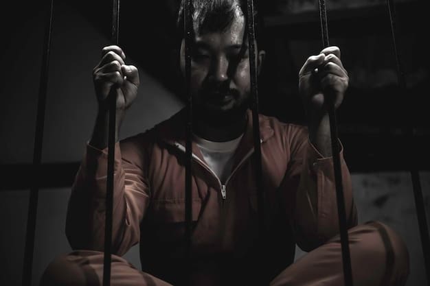
Prisoners (2013): The Desaturated Nightmare
Denis Villeneuve’s *Prisoners* employs color grading to enhance the sense of desperation and moral ambiguity at its heart. The film’s desaturated palette creates an oppressive atmosphere, mirroring the characters’ trapped states of mind.
Visualizing Despair: The Color Scheme
The color scheme in *Prisoners* is dominated by grays, blues, and browns. These muted tones strip away vitality from the scenery and characters, amplifying the feeling of hopelessness.
Impact on Storytelling
The desaturation isn’t merely aesthetic; it drives the narrative. Each rain-soaked street and dimly lit room feels like it’s suffocating the characters, pulling viewers deeper into their despair. This visual approach perfectly aligns with the themes of loss, faith, and moral decay that define *Prisoners*.
The drab color palette of *Prisoners* turns the film into a visual representation of its characters’ turmoil, immersing viewers in a relentless state of anxiety and anguish.
Sicario (2015): Contrasting Hues of Morality
Also directed by Denis Villeneuve, *Sicario* uses color grading to highlight the stark contrasts between the idealistic world of law enforcement and the gritty reality of cartel warfare. The film utilizes contrasting hues that mirror the shifting moral landscapes of its story.
Color Dynamics Reflecting Moral Ambiguity
In *Sicario*, warm desert tones clash with the cool blues of government interiors, reflecting the inner conflict of the protagonist, Kate Macer. These color dynamics emphasize her wavering sense of right and wrong as she delves deeper into the murky world of counter-narcotics.
Building Tension Through Visual Duality
The film’s color palette reflects its thematic tensions. The harsh, sun-baked exteriors during cartel operations contrast sharply with the sterile environments of government buildings. This contrast puts Kate’s moral compass to the test and underscores the brutal realities of her assignment.
- Warm Tones: Represent the lawless, dangerous landscapes controlled by cartels.
- Cool Tones: Illustrate the cold, calculated nature of governmental operations.
- Duality: Highlights the moral ambiguity faced by the protagonist.
*Sicario* masterfully enhances its narrative complexity through color grading, making viewers constantly aware of the dueling worlds and ethical quandaries that define the film’s intense atmosphere.
Nightcrawler (2014): The Glow of Obsession
Dan Gilroy’s *Nightcrawler* uses color grading to reflect the neon-lit, morally bankrupt world of its protagonist, Lou Bloom. The film’s vibrant yet unsettling palette amplifies his obsessive journey into the darkest corners of journalism.
Illuminating Moral Decay
The nighttime scenes in *Nightcrawler* are bathed in artificial light, creating an eerie, hyper-real feel. Neon signs and emergency lights highlight the predatory nature of Lou’s pursuit, reflecting his gradual descent into moral ambiguity.
Color as a Character
Color grading in *Nightcrawler* turns the city of Los Angeles into a character itself. The vibrant yet sleazy hues symbolize the superficiality and ruthlessness that drive Lou’s ambitions.
- Neon Lights: Represent the superficial allure and moral decay of the city.
- Artificial Glow: Enhances the unnatural and exploitative nature of Lou’s actions.
- Nighttime Setting: Amplifies the sense of darkness and secrecy surrounding Lou’s activities.
The distinctive color palette in *Nightcrawler* highlights Lou Bloom’s transformation, mirroring his gradual metamorphosis from an ambitious outsider to a morally compromised figure who thrives in the shadows.
The Others (2001): A Spectral Palette
Alejandro Amenábar’s *The Others* relies on color grading to create a chilling, gothic atmosphere, suggesting a world haunted by secrets and spectral presence. The film’s pale, muted hues deepen its themes of isolation and supernatural mystery.
Creating a Ghostly Ambiance
*The Others* employs a limited color palette, dominated by pale blues, grays, and whites, enhancing the sense of entrapment within the family’s isolated mansion. This delicate grading underlines the film’s ghostly themes and underscores the characters’ vulnerability.
Color Symbolism in a Haunted Setting
The washed-out colors symbolize the fading memories and hidden truths that haunt Grace and her children. The dim, filtered light increases tension and isolates the characters from the outside world, amplifying the feeling of a crumbling reality.
Through its careful color grading, *The Others* not only crafts an eerie atmosphere but also reflects the characters’ internal states, intensifying both the supernatural and psychological depths of the story.
The Contrast Between Films
Each film demonstrates how color grading enhances mood and underscores themes integral to thrillers. *Prisoners* desaturates to convey despair; *Sicario* juxtaposes warm and cool tones to highlight moral conflicts. *Nightcrawler* glimmers with predatory hues, and *The Others* chills with its spectral palette.
The Broad Application of Color Grading in Modern Thrillers
Modern thrillers use color grading to manipulate emotional responses, shape environments, and offer deeper storytelling layers. The art is pivotal in creating immersive experiences.
The Impact on Viewer Engagement
Through sophisticated color grading, modern thrillers pull viewers deeper into their narratives, making suspense palpable and horrors more unsettling. Visual narratives profoundly enhance the sensory experience of cinema.
| Key Point | Brief Description |
|---|---|
| 🎨 Color Grading | Enhances mood, suspense, and guides audience perception. |
| 🌧️ Prisoners | Uses desaturation to amplify hopelessness and despair. |
| 🌵 Sicario | Contrasts warm and cool tones to reflect moral ambiguity. |
| 🌃 Nightcrawler | Reflects moral decay through hyper-realistic neon-lit scenes. |
Frequently Asked Questions
▼
Color grading is the process of altering and enhancing the color of a motion picture. It involves adjusting color, contrast, and saturation to create specific moods and visual styles.
▼
It significantly influences emotional responses and atmosphere. Specific palettes can induce feelings of suspense, comfort, or unease, guiding the audience through the narrative.
▼
Professionals use advanced software like DaVinci Resolve, Adobe Premiere Pro, and FilmLight Baselight. These tools allow precise control over color and tonal adjustments.
▼
In thrillers, color grading heightens suspense and psychological tension. It creates a visually unsettling environment that deepens engagement and enhances the film’s impact.
▼
Yes, it can be modified for different releases, such as streaming versus theatrical versions, to optimize the viewing experience on various platforms.
Conclusion
Color grading stands as a critical component of modern thriller filmmaking, shaping our perceptions and intensifying our emotional engagement. Through films like *Prisoners*, *Sicario*, *Nightcrawler*, and *The Others*, the power of visual storytelling becomes clear, proving that what we see profoundly influences what we feel.


")


