Color Grading in Thrillers: A Visual Analysis of 4 Modern Films
The use of Color Grading in Modern Thrillers: A Visual Review of 4 Films delves into how filmmakers manipulate color palettes to create suspense, enhance emotional impact, and intensify the overall viewing experience, providing a critical analysis of specific examples.
Ever wondered how movies make you feel uneasy or keep you on the edge of your seat? One powerful tool filmmakers use is color grading, and this is why the understanding of the use of color grading in modern thrillers: a visual review of 4 films is essential. Let’s explore how modern thrillers use color to amplify suspense and emotional impact, focusing on a few notable examples.
The Power of Color Grading in Thrillers
Color grading is more than just making a film look pretty; it’s a crucial storytelling element. In thrillers, it can set the mood, foreshadow events, and reveal character traits without a single line of dialogue. Color manipulation can significantly influence how audiences perceive the story and its characters.
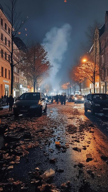
Creating Atmosphere with Color
Color grading can transform a mundane scene into something sinister. By desaturating colors or adding specific tints, filmmakers can create a sense of unease and tension that permeates the entire film.
Color as a Psychological Tool
Colors evoke different emotions, and filmmakers leverage this to manipulate the audience’s feelings. Cool colors like blue and gray can create a sense of isolation and melancholy, while warm colors like red and orange can signify danger and aggression.
- Desaturation: Reduces color intensity, creating a bleak and unsettling atmosphere.
- Cool Tones: Blues and grays evoke feelings of isolation and despair.
- Warm Tones: Reds and oranges signal danger, tension, and aggression.
- Contrast: High contrast enhances drama, while low contrast creates a dreamlike quality.
Ultimately, color grading serves as a powerful tool, amplifying the emotional undercurrents of the narrative and immersing viewers in the intended atmosphere.
Review: Prisoners (2013)
Denis Villeneuve’s “Prisoners” is a masterclass in using color to amplify tension and despair. The film primarily employs a desaturated color palette, dominated by blues and grays, reflecting the bleakness of the narrative.
Desaturated Palette
The almost complete absence of vibrant colors mirrors the emotional barrenness experienced by the characters. This reinforces the sense of hopelessness and desperation that pervades the film.
Blue and Gray Dominance
These cool tones contribute to the film’s somber and unsettling mood. The consistent use of these colors visually emphasizes the themes of isolation and moral ambiguity.
In essence, the color grading in “Prisoners” actively enhances the narrative, intensifying the viewer’s emotional involvement and reinforcing the movie’s disturbing themes.
Review: Seven (1995)
David Fincher’s “Seven” is renowned for its grim and unsettling aesthetic, heavily influenced by its color grading. The film’s visual style is characterized by its exceptionally dark and desaturated tones, mirroring the depravity and moral decay at the heart of its narrative.
Darkness and Shadow
The dominance of shadows and low-key lighting not only creates a sense of claustrophobia and fear but also obscures moral clarity. Nothing is clear-cut in this world, and the color grading emphasizes this ambiguity.
Desaturation and Grime
The muted color palette, filled with grays and browns, enhances the film’s gritty realism. The world of “Seven” feels dirty, both physically and morally, and the color grading is instrumental in conveying this.
- Low-Key Lighting: Creates a sense of unease and claustrophobia.
- Muted Colors: Enhances the film’s gritty and realistic portrayal of urban decay.
- Shadow Play: Symbolizes the moral ambiguities and hidden darkness within the characters and the story.
Through its calculated use of color grading, “Seven” becomes a visually disturbing experience, perfectly aligning with its dark and morally challenging themes and enhancing its profound impact on the audience.
Review: Blade Runner 2049 (2017)
“Blade Runner 2049,” directed by Denis Villeneuve, employs color grading to create a visually stunning and emotionally resonant dystopian world. The film uses specific color palettes to convey different environments and emotional states.
Neon Dystopia
The film’s urban landscapes are often saturated with neon colors, particularly pinks and blues, which create a striking contrast with the bleakness of the overall setting. This juxtaposition highlights the artificiality and moral decay of the future world.
Earth Tones and Desolation
In contrast, the scenes outside the city often feature earth tones, conveying a sense of desolation and environmental ruin. These palettes underscore the themes of loss and the consequences of environmental degradation.
In short, the use of distinct color palettes ensures that the world feels consistently immersive and emotionally engaging, adding depth to the narrative’s exploration of identity and what it means to be human.
Review: Midsommar (2019)
Ari Aster’s “Midsommar” uses color grading in a particularly striking and unsettling way, contrasting sharply with traditional thriller aesthetics. The film is set almost entirely in bright daylight, using vibrant, almost oversaturated colors to create a sense of unease and disorientation.
Inversion of Expectations
Unlike most thrillers that rely on darkness and shadows, “Midsommar” uses constant daylight to amplify its disturbing themes. This subversion of genre norms makes the horror even more unsettling.
Symbolism through Color
The film also uses color symbolically, with certain hues associated with specific emotional states or events. The vibrant colors of the Swedish countryside mask the sinister rituals taking place, adding a layer of psychological depth to the visual narrative.
- Bright Daylight: Creates a false sense of security, making the horror more unsettling.
- Oversaturated Colors: Enhances the surreal and dreamlike quality of the film.
- Symbolic Use of Hues: Adds layers of meaning to the visual storytelling, enriching the viewer’s experience.
By subverting expectations and using color symbolically, “Midsommar” elevates its unsettling atmosphere, proving that effective color grading can redefine a film’s impact.
| Key Aspect | Brief Description |
|---|---|
| 🎨 Color Grading Basics | How colors evoke emotions and set the mood in thrillers. |
| 🎬 Prisoners’ Palette | Desaturated tones reflect the bleakness and despair of the film. |
| 🌃 Blade Runner’s Neon | Contrasting neon colors depict a dystopian future. |
| ☀️ Midsommar’s Daylight | Inverts thriller norms with bright daylight and vibrant hues. |
FAQ
▼
Color grading is the process of altering and enhancing the color of a motion picture. It is used to create specific moods, establish visual styles, and ensure consistency across different scenes. Effective color grading supports the storytelling and enhances the viewer’s experience of the film.
▼
Desaturation reduces the intensity of colors in a film, often creating a bleak and unsettling atmosphere. This technique is commonly used in thrillers to evoke feelings of unease, despair, and isolation, effectively amplifying the tension within the narrative.
▼
Cold tones, such as blues and grays, are used in thrillers to create a sense of detachment and emotional coldness. They can enhance feelings of loneliness, anxiety, and foreboding, which are often central themes in thriller narratives.
▼
Yes, color grading can be used symbolically in thrillers to represent different themes or character traits. For example, the use of red might symbolize danger or passion, while green could represent envy or decay, adding layers of meaning to the visual storytelling.
▼
“Midsommar” inverts typical horror tropes by setting its disturbing events in bright daylight. This creates a false sense of security, making the dark and gruesome elements of the story even more shocking and unsettling, heightening the psychological impact on the audience.
Conclusion
In conclusion, the use of color grading in modern thrillers: a visual review of 4 films, illustrates how this cinematic technique significantly shapes the audience’s emotional experience and enhances narrative depth. From the bleak desaturation in “Prisoners” to the vibrant, unsettling daylight of “Midsommar,” color grading is a powerful tool for filmmakers to evoke tension, convey symbolism, and redefine genre conventions. By skillfully manipulating color palettes, directors can elevate their stories, creating memorable and impactful viewing experiences.


